
Museum object labels
An object label is the smallest print job in a gallery and the one visitors lean in to read. It also sits closer to your collection than anything else you will print.
Ask your conservator before you ask us.
Materials placed inside a sealed display case share the air with your objects. Some plastics, adhesives, inks and boards can release vapours that may harm sensitive items over time. Foamex, for instance, is foamed PVC, so it should not go near a case without approval. Museums often use accelerated corrosion tests, such as the Oddy test, to check materials used in cases. Your conservator will know what your institution allows. Bring that answer to us, and we will tell you what we can supply, or whether your own approved material is the best route.
Where the label sits changes everything
| Position | Things to think through | Starting point |
|---|---|---|
| Inside a sealed case | Vapour risk, access for changes, angle | Only conservator-approved materials |
| On a case plinth or rail | Reflections and knocks | Thin board, sealed, with neat edges |
| On a wall beside an object | Reading height and glare | 3mm Foamex or vinyl lettering |
| Outdoors or in a historic room | Light, damp and cleaning | Ask us about the location |
Reading in low light
Galleries holding light-sensitive objects can be very dim. Text that looked fine in the design office can be a struggle there, particularly for older visitors. Use a clear typeface and strong contrast, and avoid thin strokes. Dark text on a pale ground generally works best. Avoid reversed-out text at small sizes, as ink can fill in the letter shapes.
Size your type for the real reading distance, including a person in a wheelchair looking at a case from a lower angle. Many museums have their own minimum sizes and text guidelines. If yours does not, national accessibility guidance is a sensible reference, and your access lead or panel should have the final say. Offer large-print versions for anyone who needs them.
A proofing routine
- Finish the text and have it checked by a curator.
- Check lenders' credit lines against the loan agreement. Lenders often specify the exact wording.
- Print a sample at actual size and take it into the gallery, under the actual lights.
- Check the accession numbers, dates and spellings of names against your records.
- Lay out all labels as a numbered list, with each label's object and position.
- Order a few spares of the labels likely to need updating.
Keeping things consistent
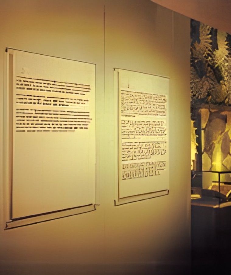
Visitors notice when labels vary. Keep the same width, type sizes and order of information all through a gallery: title, maker, date, material, then a short interpretive line. Using one template also makes reprints simple, and a single label can be replaced without disturbing the set.
Matt and edges
A gloss finish under spotlights can make a label unreadable from some angles. A matt seal or laminate avoids that. Look closely at cut edges, because at this scale any rough edge shows. Board edges and how they look shows what to expect. For bigger text, go to our museum exhibition graphics page.
Text beside the object.
Your questions.
Can you print many small labels in one order?
Yes, tell us how many labels you have and their sizes. Grouping them into one order usually makes the most sense. Ask us how we would set them out.
Can one label be reprinted later?
Yes, if the artwork and material are known. Keep your template and a note of the specification so a replacement matches the others.
Can vinyl lettering go straight on a case or wall?
Often it can, and it gives a clean result. Check with your conservator and your display team first, especially near objects or on a case's glass.