
Gloss or matt lamination
For most displays, choose matt: it stays readable under spotlights and in front of windows. Choose gloss when deep colour matters most and you control the light.
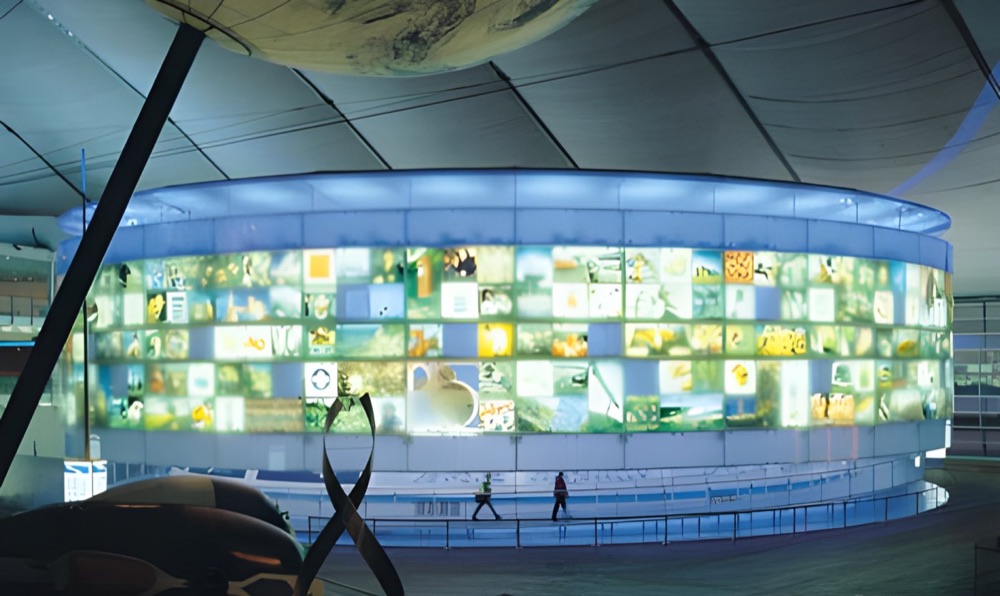
Why the answer is usually matt.
A laminate lies on top of everything, so its surface decides how the print meets the room. A glossy film throws back light like a window pane. Walk past a gloss panel in a room with a row of ceiling spots, and you will see a line of bright dots travelling across the image with you. Matt scatters that light, so the picture stays visible from more angles. For text panels, wayfinding and anything read for more than a moment, that wins.
Gloss has a real case, though. It keeps blacks dark and colours saturated, and it gives a photograph a wet, crisp depth. A matt film slightly softens contrast, because of that same scattering. If you are showing a food photo or a car in a lit case, gloss looks closer to the screen you approved it on.
| Situation | Pick | Why |
|---|---|---|
| Text panels in a gallery | Matt | Spotlights stay out of the reader's eye |
| Windows opposite the wall | Matt | Avoids mirror-like reflections |
| Press wall or filming backdrop | Matt | No flash glare in the photographs |
| Food photography on a counter display | Gloss | Rich colour for close viewing |
| Point of sale in soft, even light | Gloss | Extra punch with little glare |
| Dark image in a bright room | Try both | Glare and softness are both an issue |
Two points people miss.
Marks show differently. Gloss shows fingerprints and fine scratches when the light catches them, and wipes clean easily. Matt hides fine scratches, but grease can polish a shiny patch where people keep touching it. A handrail-height panel is a good example, so think about how close hands will come.
Boards amplify it. A laminate on a rigid panel lies very flat, and that makes reflection crisper. A slight wave in a paper poster breaks glare up, while a flat board shows it perfectly. A gloss film that looked fine on a sample in your hand may be hard work on a large mounted board. See mounting and laminating for your board options.
The ten-minute test.
- Ask for a small sample of each, or hold up any glossy magazine and a sheet of matt paper.
- Stand them on the wall where the print will go.
- Look at them at the time of day when the room is at its brightest.
- Move to where people will really stand, and to one side.
- Turn on the lights the room uses in the evening, and look again.
This is about the laminate over a finished print. If you are choosing paper for an unprotected poster, read matt or gloss posters instead. Laminates and finishes vary, so please ask which are available for your material and size.
Print under strong light.

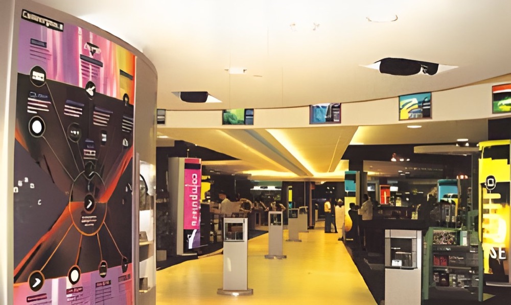
Your questions.
Is there anything between gloss and matt?
Satin or silk finishes sit between the two, with a low sheen. Ask us what is available for your print and board.
Does lamination change how colours look?
Slightly. Gloss tends to deepen colour and matt tends to soften it. If an exact match matters, ask for a proof with the finish applied.
Is one tougher than the other?
Both protect the print from everyday wear. The difference is more in how marks show than in how easily they happen.