
Choosing fonts for signs
Type a capital I, a lower-case l and the figure 1 in your chosen font. If you cannot tell them apart on screen, nobody will on a sign.
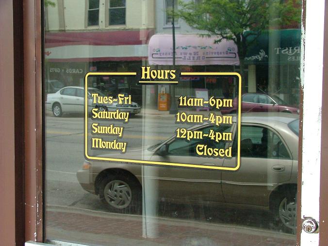
What makes letters read at a distance.
Road signs and railway stations have been studied for decades, and the fonts made for them share the same habits. The Transport lettering on British road signs, the Rail Alphabet and Frutiger, drawn for an airport in France, are all clean sans serif designs with open shapes. You do not need those exact fonts, but they show what to look for.
| Feature | Good sign | Warning sign |
|---|---|---|
| Lower-case height | Tall x-height, so small letters stay large | Tiny lower case beside tall capitals |
| Openings | Wide gaps in c, e, a and s | Letters that nearly close up at a distance |
| Stroke weight | Regular or medium, fairly even | Hairline or very heavy |
| Similar characters | I, l, 1 and O, 0 look different | Shapes that can be confused |
| Width | Normal proportions | Tightly condensed |
Which style for which job?
- Directions and safety. Plain sans serif, in sentence case, and never decorative. For statutory or accessibility requirements, check the current guidance for your building.
- Shop fascias. You have more freedom, as a name is read as a shape. A serif or a script can work well if it is short and large.
- Banners. A bold sans serif for the headline, with one lighter weight for detail.
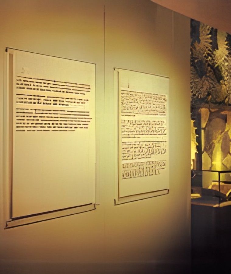
- Gallery and museum panels. Readers stand still, so a good serif is fine for longer text. Keep line lengths short.
When the material gets a say
Cut vinyl. Fine serifs and thin strokes can be fragile, and they may lift or tear when applied. Our cut vinyl lettering list starts at 15mm in height, so choose a sturdy font for small lettering.
Backlit graphics. Light spreads into white letters on a dark ground, which makes them look bolder. Choose a slightly lighter weight, and open up the letter spacing.
Rough or textured surfaces. Canvas, mesh and coarse fabric nibble at fine detail, so favour simpler letters.
Spacing often matters more than the font
Sign lettering usually needs slightly looser spacing than print, especially at a distance, as tight letters blur together. Watch out for pairs like r and n, which can read as m. Use one or two fonts at most. Any more and the sign starts to look like a ransom note.
The doorway test
Print the words at full size, or at the largest your printer can manage. Tape it up, walk away and turn round. Ask someone who has not seen the wording to read it. Once the font is settled, our letter height table gives you a size, and choosing colours for signs will help with contrast.
Fonts are licensed, too. Check that yours covers signage and logos, particularly if you downloaded it from a font website.
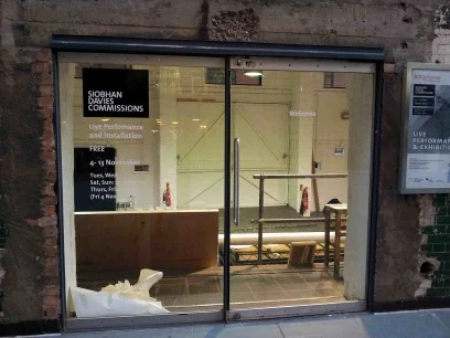
Lettering at work.
Your questions.
Are serif fonts bad for signs?
Not at all. They work well for names and for text read by people standing still. They are a weaker choice for quick direction signs and small cut vinyl.
Should a sign be in capitals?
A word or two can be. Longer lines are easier to read in sentence case, as the shape of each word helps the reader.
Can I use my brand font on every sign?
Usually yes for headlines. If it is thin or decorative, ask your designer about a plainer companion for directions and small text.