
Choosing colours for signs
The colours on a sign matter far less than the difference between them. A drab pairing with strong contrast will out-perform a beautiful pairing that blurs at ten paces.
Test in greyscale first.
Take your sign design and turn it to black and white on screen. If the words stay crisp, your colours have good contrast. If they turn into two similar greys, the sign will be hard to read at a distance, at dusk, and for many people with colour vision differences. It takes seconds, and no other test tells you so much.
| Letters on background | Reading | Notes |
|---|---|---|
| Black on yellow | Very strong | High visibility, so it can feel like a warning |
| Black on white | Very strong | Plain, reliable, suits most uses |
| White on dark blue | Strong | Calm and professional |
| White on dark green | Strong | Works well on heritage shopfronts |
| Yellow on black | Strong | Good for evening trade |
| White on red | Good | Reads well, though it suggests a sale |
| Red on green | Poor | Similar tones; many people cannot separate them |
| Grey on white | Poor | Fashionable and hard to read |
| Orange on red, or blue on black | Poor | Tones too close together |
Where the sign lives.
Against the building. A red sign on red brick loses its edges. Stand across the street, and see what is around it. A pale panel or a border can separate the sign from its background.
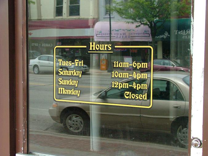
In real light. Colours on a screen glow. Colours on a sign reflect the daylight or street lighting that reaches them, so they can look quite different. A dark sign on a north-facing wall can seem very sombre. Check a printed sample at the real location if you can, ideally at the time of day your customers pass.
Over time. Sunlight fades all coloured materials, and how fast depends on the material, the inks and the aspect. Pale tints show the change less, and strong reds and yellows are often said to go first. If a sign must last in full sun, ask us about materials and finish.
Readers who see colour differently.
Red and green confusion is the most common form of colour vision deficiency, so never use colour alone to carry a message. Add a word or symbol as well. If you are making signs that have to meet accessibility requirements, such as those for a public building, take advice from a qualified access consultant or the organisation responsible. Guidance varies, and this page is not a substitute.
Matching your brand.
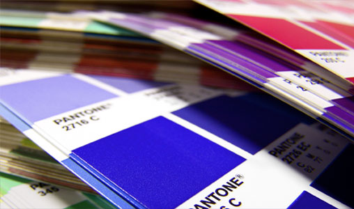
Brand colours do not always make good sign colours. A pale logo colour might need a darker version for text, with the brand shade kept for a stripe or shape. If you have a Pantone reference, give it to us. Cut vinyl lettering is available in Pantone colours, and our page on matching Pantone colours explains what to expect from print. Metallics are another option, if used sparingly, and they change a lot with the light.
Limit the palette.
Two colours plus one accent is plenty. Every extra colour weakens the others. Pair this page with choosing fonts for signs, since letter shape and colour work together, and a thin font needs more contrast than a bold one.
Colour in the real world.

Your questions.
Can you match my brand colour exactly on a sign?
Print colours can usually come close, and cut vinyl can be chosen by Pantone reference. Ask for a sample if the match is critical.
Do dark or light backgrounds read better?
Both work if the contrast is strong. Light letters on a dark background can seem to spread slightly at a distance, so leave a little extra space between them.
Do colours look different on vinyl and on board?
Yes, a little. The surface and finish affect how colour appears, so compare samples on the actual material.