
Text size for long-distance reading
Too small and nobody reads it. Too big and the message will not fit. A simple rule of thumb gives you a starting height for any sign, banner or panel.
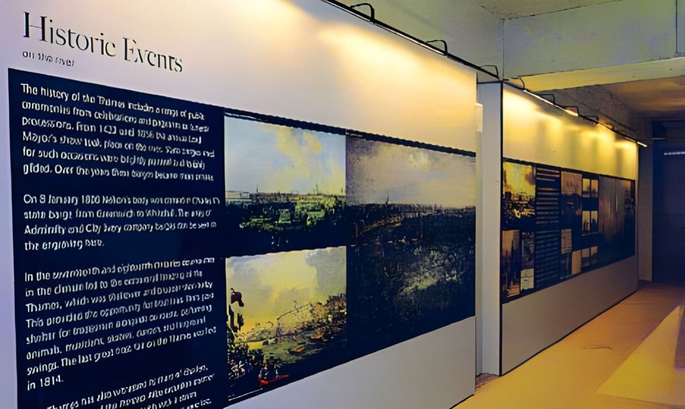
Start with the rule of thumb.
A common guide in the sign trade is around 25mm of letter height for every 3 metres of comfortable reading distance. Treat it as a starting point, not a law. The height is measured on capital letters.
| Reading distance | Letter height | Typical use |
|---|---|---|
| 3m | 25mm | Notices and exhibition panels |
| 6m | 50mm | Room signs and roller banners |
| 15m | 125mm | Across a hall or car park |
| 30m | 250mm | Across a road or large site |
Things that change the answer
Contrast. Dark text on a pale background, or the reverse, reads from further away than two similar tones. Text over a busy photo loses the most.
Typeface. Plain, open letter shapes read better than thin, decorative or tightly condensed ones.
Capitals. A long line in all capitals is slower to read. Save capitals for very short words.
Speed. Someone walking has time. Someone driving past has seconds, so use fewer words and bigger letters.
Light. A dim room or a sign seen at dusk needs extra help, whether that is stronger contrast or backlighting.
Cut the words first
If the text will not fit at the right size, the answer is rarely a smaller font. Take words out. Most signs need one message, not five.
Test before you print
Print the key line at full size on ordinary paper, or even a few sheets taped together. Stick it where the sign will go, walk to the far end of the space and try to read it. This costs almost nothing and beats any table.
Cut vinyl lettering by height
If you only need text, cut vinyl can be cheaper than a full print. It is priced by the character.
| Letter height | Price per character |
|---|---|
| 15mm to 40mm | £0.65 |
| 41mm to 80mm | £0.99 |
| 81mm to 120mm | £1.40 |
| 121mm to 180mm | £2.70 |
| 181mm to 250mm | £4.20 |
Guide prices from our price list. They exclude VAT and delivery and assume print-ready artwork.
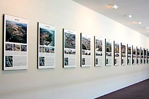
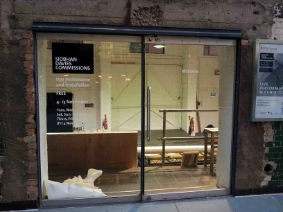
Text in real settings.
Your questions.
Does the rule work for lower-case letters?
The guide is based on capital height. Lower-case letters are smaller, so allow a little more if your sign is set in lower case.
How much text should go on a banner?
As little as possible. A headline, one line of detail and a way to get in touch is usually plenty.
Can you check my layout?
Yes. Send us the artwork and where it is going. Our designers can also set it out for you.