
Matching Pantone colours
A Pantone number describes one ink on one kind of paper. Reproducing that colour on vinyl, fabric or canvas is a job of getting close, and some colours get closer than others.
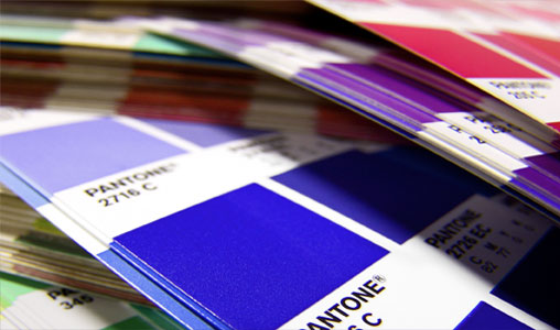
What the number actually tells us.
Pantone references such as 186 C describe a specific pre-mixed ink. The letter matters. C means coated paper and U means uncoated, and the same number can look noticeably different between the two. Always quote the whole reference, including the suffix.
Large format inkjet does not use pre-mixed spot inks. It builds each colour from a small set of process inks, so a printer can only reach a colour if it lies inside the range those inks can produce. Many Pantones do. Some, notably intense oranges, bright violets and metallics, do not.
Which route gets you closest?
| What you need | Best route | How close |
|---|---|---|
| Flat lettering or a simple logo | Cut vinyl in Pantone colours | Coloured film, so even and consistent |
| Colour within a full-colour print | Inkjet, with a proof | Often close, depends on the colour and material |
| A colour across several materials | Inkjet proofs on each one | Expect small differences; agree an acceptable match |
| Metallic gold or silver | Metallic media | A different effect, not a match to a metallic ink |
The material changes the colour
The same file printed on gloss paper, PVC, canvas and fabric will look like four relatives, not identical twins. Each surface has its own base colour and sheen, and takes ink differently. If your stand combines several materials, tell us at the start. We can look at the hardest one first and bring the others towards it.
How to brief a colour match
- Give the full Pantone reference and any brand guidelines.
- Say how critical it is. A logo colour on a head office wall is not the same as a tint in a background.
- Lend us a physical reference if you can, such as a previous print you were happy with.
- Ask for a proof on the actual material, viewed in light similar to the final location.
Is your swatch book reliable?
Pantone books fade and yellow over time, particularly when left open in daylight. Colours on screen are not a reference, even in a PDF of your guidelines. If there is a disagreement, the printed book in good condition is the fairest judge.
Cut vinyl costs
Cut vinyl is priced by letter height. Letters between 81mm and 120mm tall, for example, cost £1.40 per character.
Guide prices from our price list. They exclude VAT and delivery and assume print-ready artwork.
For more on how ink colour differs from screen colour, read RGB and CMYK for print.
Colour references and materials.
Your questions.
Will a print match the Pantone exactly?
Not on every colour and material, and no printer can honestly promise that. What we can do is proof it and tell you how close it will get.
Why does my CMYK breakdown look different from the swatch?
Published breakdowns are the nearest process mix, not a perfect equivalent, and some colours shift a lot. A proof will show you what to expect.
Should I include the Pantone in my PDF?
Yes, keep it as a named colour in the file if you can. Mention it in your notes too, so that nothing is lost.