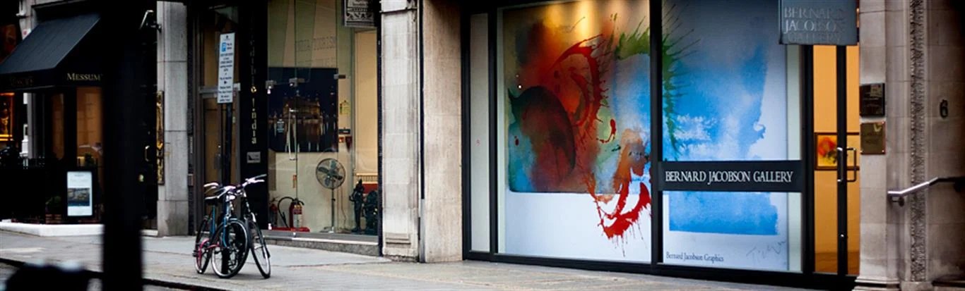
Signs & display graphics
Make your business easier to find and your message easier to follow.

Good wayfinding is mostly invisible: people reach the right place without thinking about it. For facilities managers and designers, wayfinding signs work as a system, which means planning the route before choosing a sign.
A scheme works by giving information at the moment someone needs to choose. Walk each journey from the entrance and mark every junction, lift lobby and stairwell. Those are the points that need a sign, while a long straight corridor might need only a reassurance marker. Group destinations sensibly, as a panel with twelve entries is hard to read at walking pace. Repeat the same name from first sign to last, because a department that changes label halfway through a route loses people.
Letter size should follow the viewing distance, and strong contrast between text and background helps everyone. Clear sans serif type, consistent arrows and simple symbols tend to work better than decorative fonts. Mounting heights, tactile features and contrast can be covered by accessibility guidance, so ask your access consultant or check the standards relevant to your building. Glare is easily overlooked: a glossy panel under a downlight can become unreadable, while matt finishes are generally easier to read from an angle.
Tenants move and departments rename themselves, so avoid printing a whole directory as one fixed panel. Slats or individual plates let you change a line without replacing the sign. Materials can vary by location:
Keep a schedule of your wayfinding signs listing each position, wording and size, which makes future reorders simple.
Directional signs are one part of a wayfinding system. A full system may also include identification signs, maps and reassurance markers, all using shared naming and a consistent style across the whole site.
Often, with a photo, the sizes and your brand colours. Materials and colours can differ from an older batch, so ask about checking a sample against an existing sign where a close match matters.
Make your business easier to find and your message easier to follow.
Choose a rigid metal or aluminium-composite panel for signage and graphic displays.

Present images and graphics with an acrylic finish for interiors, displays and signage.
Tell us what you’re making. We’ll help you plan the print.