
RGB and CMYK for print
The short answer: do not convert a colour file just because you think you should. Ask first, as a careless conversion can dull a good image for no gain.
What the two letters mean.
RGB describes colour made of light: red, green and blue, as on a screen. CMYK describes colour made from cyan, magenta, yellow and black ink. Light can reach brighter and more saturated colours than ink on a surface, so the vivid greens, oranges and electric blues on a monitor have no exact match on paper. That is true of any printing method.
Why large format is a bit different
Advice to "always supply CMYK" comes from litho printing, where four plates are made. Wide-format inkjet printers work differently. They often use more than four inks and they run files through software that converts colour for the specific printer and material. A photo sent as RGB can pass through that step in one go, whereas a file converted to generic CMYK has already lost some of its range before it gets there.
What to do with your file.
| What you have | What to do |
|---|---|
| Photo from a camera or phone | Leave it in RGB with its colour profile embedded |
| Layout built in CMYK by a designer | Leave it in CMYK, with values unchanged |
| Corporate colours given as CMYK values | Keep those values and include the guidelines |
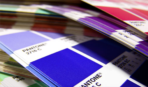
| Colours specified as Pantone | Keep the reference, and see our Pantone guide |
| Mixed RGB and CMYK in one layout | Do not force it: tell us and we will advise |
| A drum scan from us | Supplied as RGB or CMYK, so tell us which suits the job |
Avoid converting twice
Every conversion throws away some information. A photo moved from RGB to CMYK and back again will not recover what it lost, and each step can shift it further. So keep one master file in its original colour space, and save copies if you must change them.
Colours that often disappoint
- Neon greens and pinks. They rarely survive as bright as they look on screen.
- Saturated blues. These can turn slightly purple.
- Deep oranges. They may come out a little browner.
If your design relies on one of these, tell us and ask about a proof. For a logo in a single flat colour, cut vinyl can sometimes do what ink cannot.
How to check what you have
In Photoshop, the mode is shown on the title bar of the document and under Image, Mode. In Illustrator, look under File, Document Color Mode. In InDesign, check the swatches and images, as one layout can mix both. Exported PDFs can be checked in Acrobat Pro using Output Preview.
Don't judge colour from your monitor
Screens differ, and most are brighter than any print can be. Our artwork guide covers the wider file set-up, and a proof on the real material is the only proper test.
Colour on a large scale.
Your questions.
Will my print look the same as my screen?
Not exactly. A screen shines light at you and a print reflects it. A good print will look close, but bright screen colours are likely to soften.
Should I embed a colour profile?
Yes, where your software offers it. A profile tells the print software how the colours in the file were meant to look.
Is sRGB or Adobe RGB better?
Either can work if the profile is embedded. Do not re-save a file from one to the other just for print; send the original.