
Logos that print well large
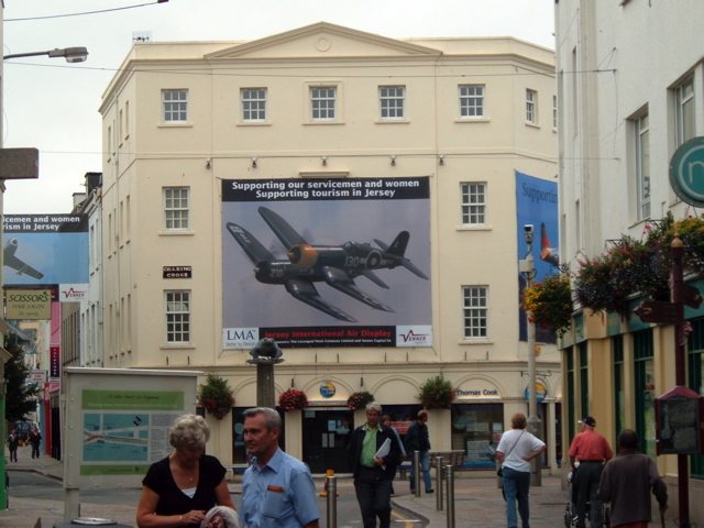
Most logos are drawn for letterheads and web pages. Blow one up to three metres wide and every shortcut in the artwork becomes visible.
What have you actually got?
Start by finding every logo file you can, then sort them.
| What you have | Verdict | What to do |
|---|---|---|
| AI, EPS, SVG or vector PDF from the designer | Ideal | Use it, and keep it safe |
| Large PNG or TIFF with several thousand pixels | Workable for moderate sizes | Check it at final size |
| Logo from a website or email footer | Too small | Ask whoever made it for the master |
| Logo inside a Word or PowerPoint file | Usually too small | As above; do not copy it out |
| Photo or scan of a printed logo | Last resort | It will need redrawing |
Our page on vector or raster artwork shows how to tell a real vector file from a lookalike. If the original designer has gone and nobody has the master, a logo can be redrawn, and our designers can quote for it. It is worth having done, as you will use that file for years.
Details that fail at scale.
Soft effects. Drop shadows, glows and bevels are often made of pixels, even in a vector file. They can look blocky when enlarged, so ask for a flat version.
Gradients. Very subtle fades across a large area may show faint stepping lines. A small amount of added noise in the artwork can break this up.
Hairlines. The reverse problem. A logo with fine lines looks fine when huge but may vanish when it is small, and it can be hard to cut in vinyl.
Registered marks and strap-lines. These often have to be redrawn or removed at one end of the size range. Check your brand guidelines first.
Versions worth preparing.
- Full colour, for light backgrounds
- Reversed, in white or a light tone, for dark backgrounds and photos
- One colour, for cut vinyl, which is made from solid sheets of film
- Stacked and horizontal, as a wide logo does not suit a roller banner, and a tall one does not suit a fascia
Size and position
Big does not always mean better. A huge logo with a tiny message tells people who you are, not why they should care. On most display graphics, the message or image should lead, and the logo should sign off. Respect the clear space in your guidelines, too. If you have none, leave at least the height of one letter of the logo around it.
Colour
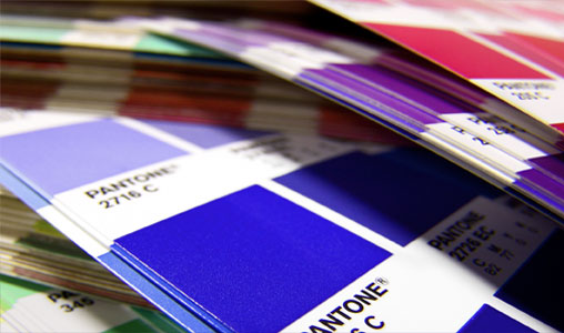
A logo is one of the first things a colleague will check on the finished piece. Give us the reference, and read about matching Pantone colours if it needs to be close. Only use logos you have the right to use, particularly partners' and sponsors' marks, and ask each owner for their approved artwork.
Marks at a large scale.
Your questions.
Can I enlarge a PNG logo in Photoshop?
You can, but it will not add detail. For a small increase it may pass, but for large display work a vector master is the right answer.
Does a logo need a transparent background?
Vector files have that naturally. If you are using a raster file, a transparent background avoids a white box on coloured artwork.
Who owns my logo file?
That depends on your agreement with the designer. Ask them for the master files, and keep your own copy.