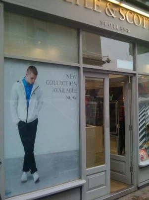
Poster printing
Put your message in focus with posters for shop windows, exhibitions, presentations and promotional campaigns.

Choosing between matt or gloss posters is often treated as personal taste, but the room usually decides for you. This guide helps anyone ordering posters for a shop, event, office or home to pick the right surface.
Stand where the poster will hang and look for light sources directly opposite. Windows, downlights and shop spotlights all bounce off a gloss surface and can wipe out parts of the image from certain angles. Matt scatters that light, so the poster reads from almost anywhere. Dim or evenly lit spaces let gloss show its strengths. If the display is in a corridor where people walk past at an angle, that angle matters more than how the file looks on your monitor.
Images with deep shadows, saturated colour and sharp product detail tend to look richer on gloss, because the surface keeps blacks dark. Text-heavy work, such as timetables, maps or conference posters, usually reads more easily on matt, and it can feel more refined for illustration or muted palettes. Satin sits between the two and is a good compromise if you are torn. Think about touch too: gloss shows fingerprints, while matt can mark if rubbed. Our poster printing page lists the broader paper choices.
Glass or acrylic glazing adds its own shine, so a gloss poster behind glass gains little. Many people choose matt or satin for framed work, or consider non-reflective glazing. For unframed posters on a busy wall, a laminate can change the finish and add protection, as explained under mounting and laminating. If you are still unsure, ask us about seeing paper samples, then hold them up in the actual room. A sample under real lighting settles the question quicker than any description.
Neither is automatically tougher, because durability depends more on paper weight and any laminate. Gloss shows fingerprints readily, while dark matt areas can scuff. For posters that will be handled, ask about a protective laminate.
Yes. Matt surfaces scatter light, so blacks look softer and colours slightly calmer than on gloss. This is normal. Your file is not at fault, but it is worth allowing for with dark, moody images.
Put your message in focus with posters for shop windows, exhibitions, presentations and promotional campaigns.

Give printed graphics the structure and finish they need.
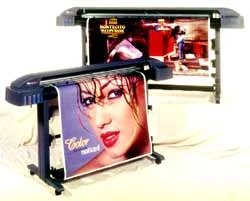
Bring digital photographs into print for portfolios, interiors and exhibitions.
Tell us what you’re making. We’ll help you plan the print.