
Viewing distance and print quality
The eye can only resolve so much detail, and the further away it is, the less it can see. So print quality is set by where your audience stands.
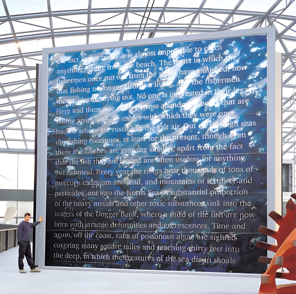
Go and stand where they will stand.
Before you worry about a file, find the closest point your audience can really get to. A hoarding behind a fence has a fixed minimum distance. A poster in a corridor does not, as people pass within an arm's length. That closest realistic distance is the one to design for.
| Closest viewing distance | Typical print | Pixels per inch to aim for |
|---|---|---|
| Under 1m | Gallery photograph, museum panel | 150 to 300ppi |
| 1m to 2m | Poster in a corridor, exhibition graphic | 100 to 150ppi |
| 3m to 5m | Pop-up wall, banner across a room | 50 to 100ppi |
| 10m and more | Scaffold banner, building wrap | 20 to 50ppi |
These are working ranges used across the trade, not rules. A clean, soft-focus image can get away with less, while a sharp architectural picture full of fine lines wants more.
Worked example: an A0 poster at 1m to 2m
A0 is 1189mm on the long edge, which is about 46.8 inches. At 100ppi, that needs about 4,700 pixels on the long edge. At 150ppi, it needs around 7,000. A modern camera can manage the first without any trouble. A picture taken from a website usually cannot. Our guide to image resolution for large prints shows how to run this sum for your own file.
Why people still come close
Viewing distance is a habit as much as a measurement. Faces, maps, timelines and small captions pull people in. If you have a large image with a detailed caption beside it, expect the audience to walk right up to it. Art audiences lean in on purpose, particularly at a show of photographers' work.
Text is less forgiving than photos
Soft edges on a landscape may go unnoticed, but the same softness on small type looks like a fault. Keep lettering and logos as vector artwork, so that they stay crisp however low the photo's resolution is. That is why a large banner can pair a modest image with very sharp headlines.
The material plays a part
Canvas and fabric have a texture that hides fine detail, so they forgive a lower resolution. Smooth gloss paper and backlit film show everything. If you are on the edge with a file, a textured surface may be the kinder choice.
How to test yours
- Open the image and scale it to the final size in your layout.
- Pick an important area, such as a face.
- Print that area at 100%, on ordinary paper.
- Pin it up, then stand at the closest realistic distance.
If it looks fine there, it will look fine at full size. Still unsure? Send us the file and tell us where it is going.
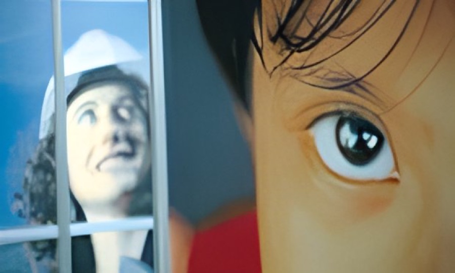
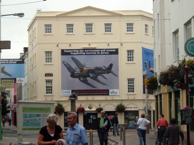
Near and far views of big print.
Your questions.
Why do billboards look blurry up close?
They are made to be read from far away, so the detail is coarse. From the road, the eye blends it into a smooth picture.
Is 300ppi needed for large prints?
Rarely at full size. It is a sensible figure for things held in the hand, such as books. A large print viewed from a metre or two usually needs less.
Does the same rule apply to canvas?
Yes, though the weave hides a little fine detail. Canvases are often seen from across a room, but people do step in close to look.